Oasen
A sensory-safe skincare brand empowering young neurodiverse individuals, fostering confidence and skin health.
Branding - Advertising - Motion Graphics
Awarded
Brief
How we might increase the skin confidence of every young person to enable their unique identity to flourish?
Team
Visual Identity, Advertising, Motion Design - Emily Willis
3D and Packaging - Julia Barbagallo
Research and Concept - Julia and Emily
TOOLS: Photoshop, After Effects, Illustrator
The Solution
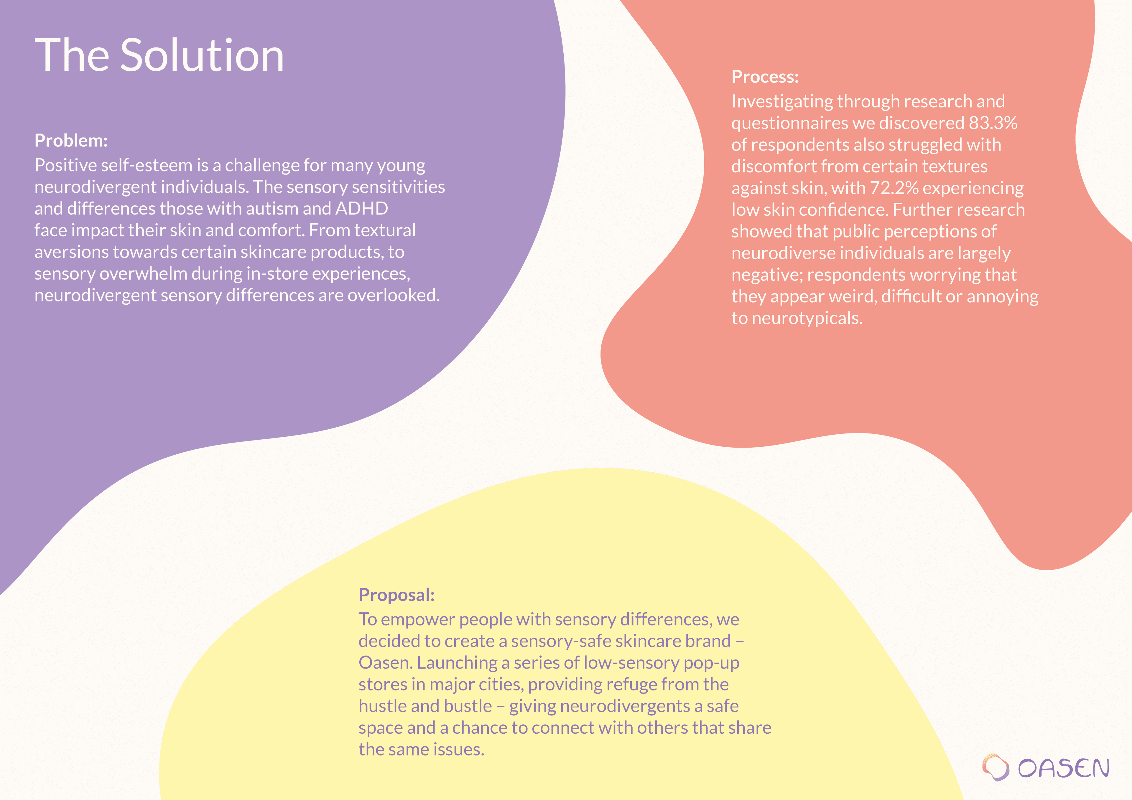
Problem
Positive self-esteem is a challenge for many young neurodivergent individuals. The sensory sensitivities and differences those with autism and ADHD face impact their skin and comfort. From textural aversions toward certain skincare products, to sensory overwhelm during in-store experiences, neurodivergent sensory differences are overlooked.
Process
Investigating through research and questionnaires we discovered 83.3% of respondents also struggled with discomfort from certain textures against skin, with 72.2% experiencing low skin confidence. Further research showed that public perceptions of neurodiverse individuals are largely negative; respondents worrying that they appear weird, difficult or annoying to neurotypicals.
Proposal
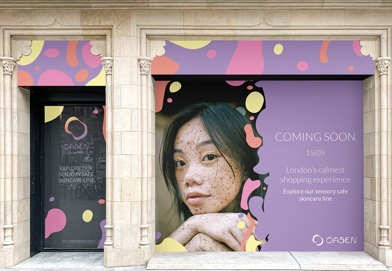
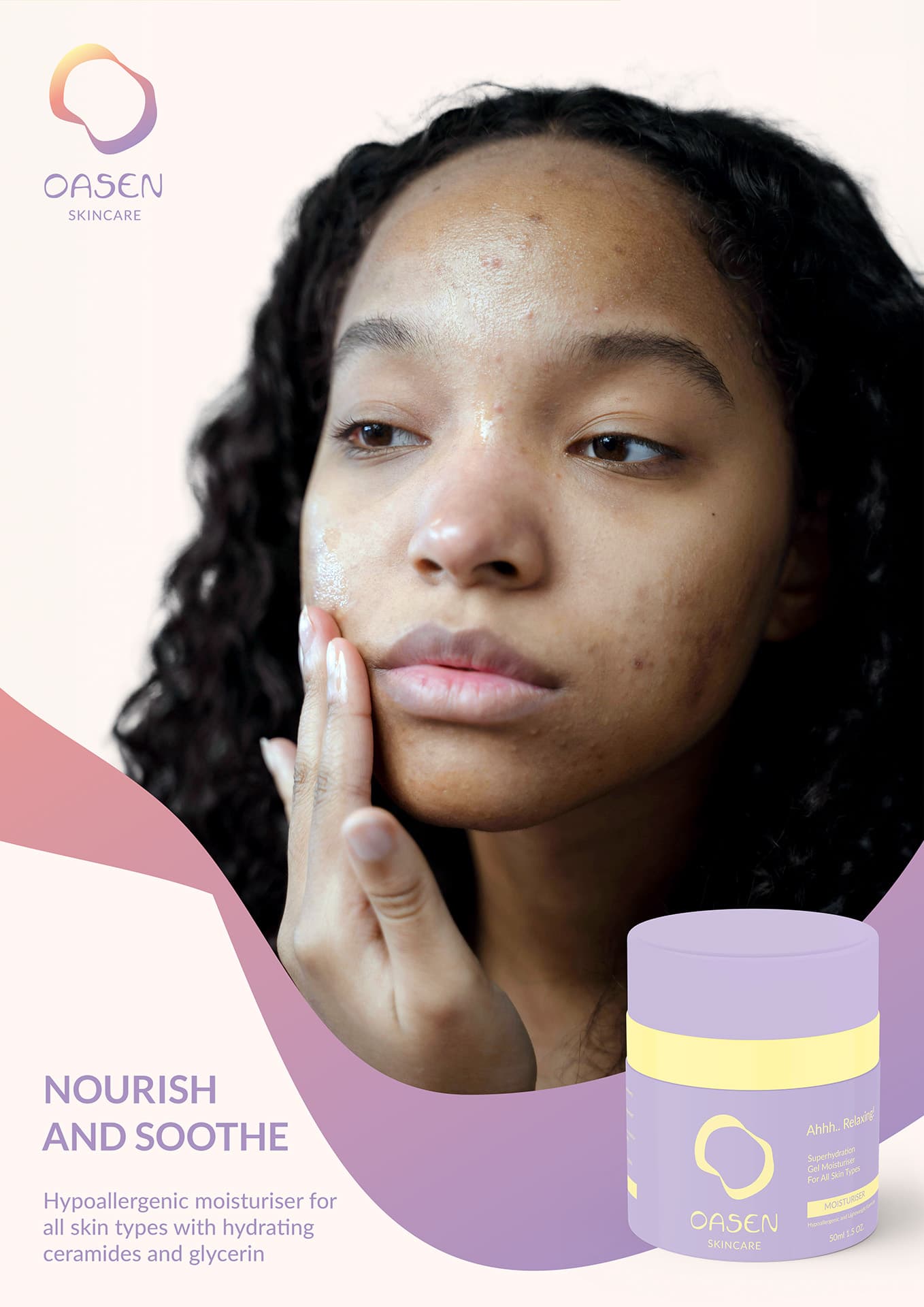
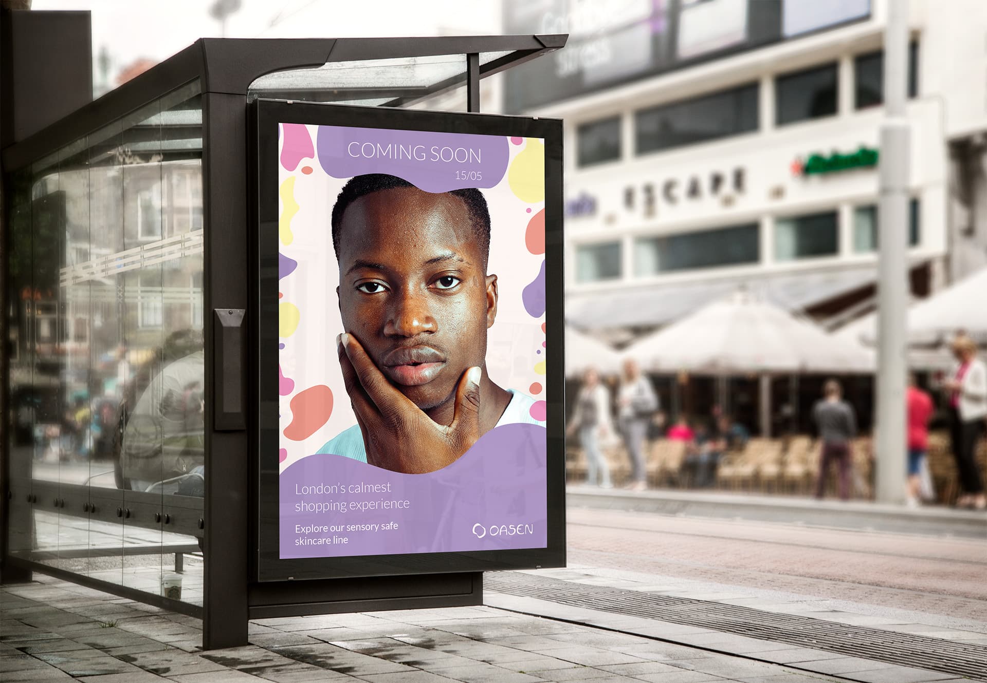
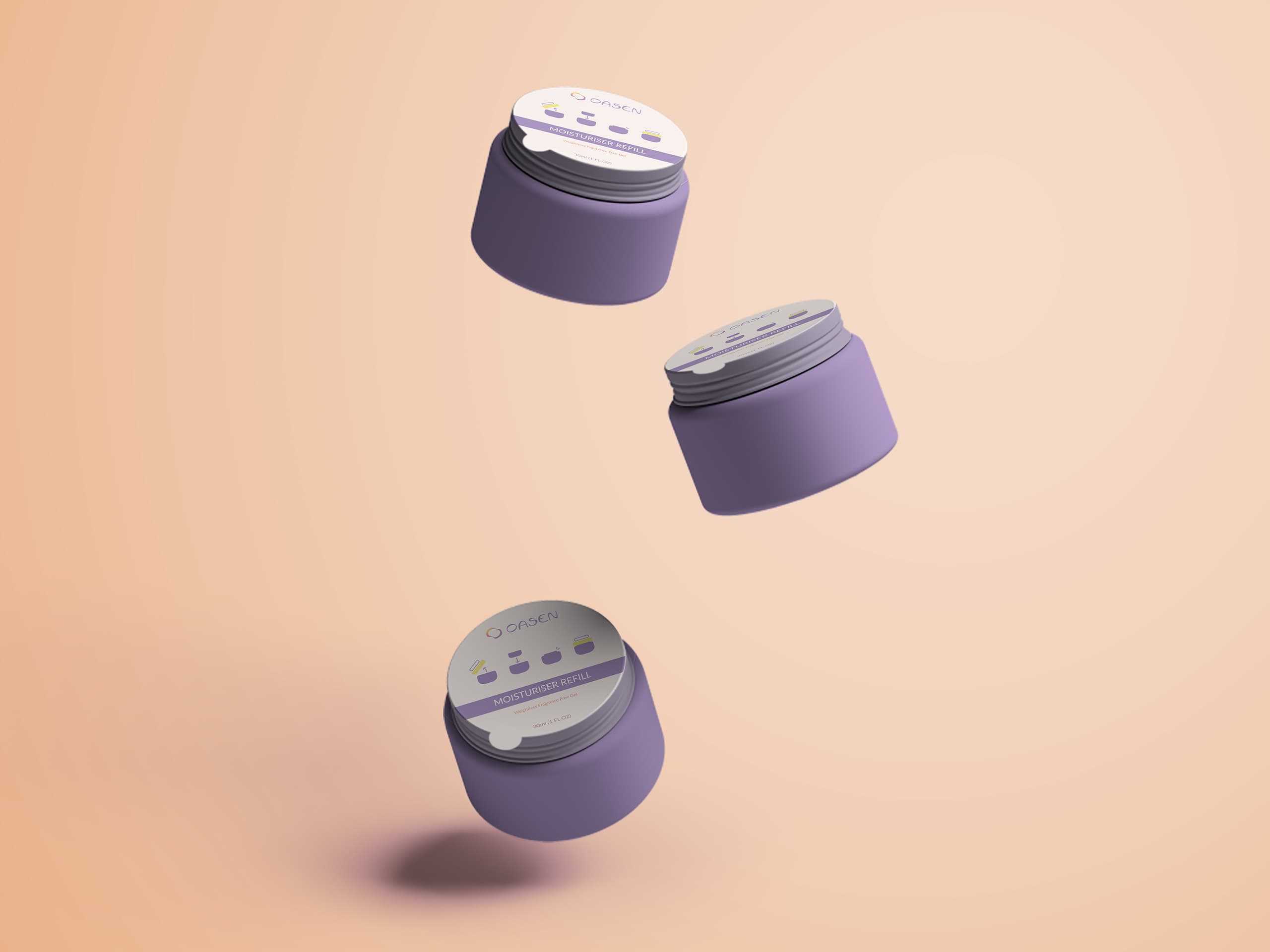
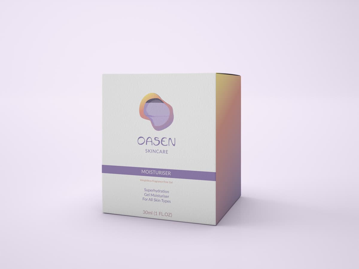
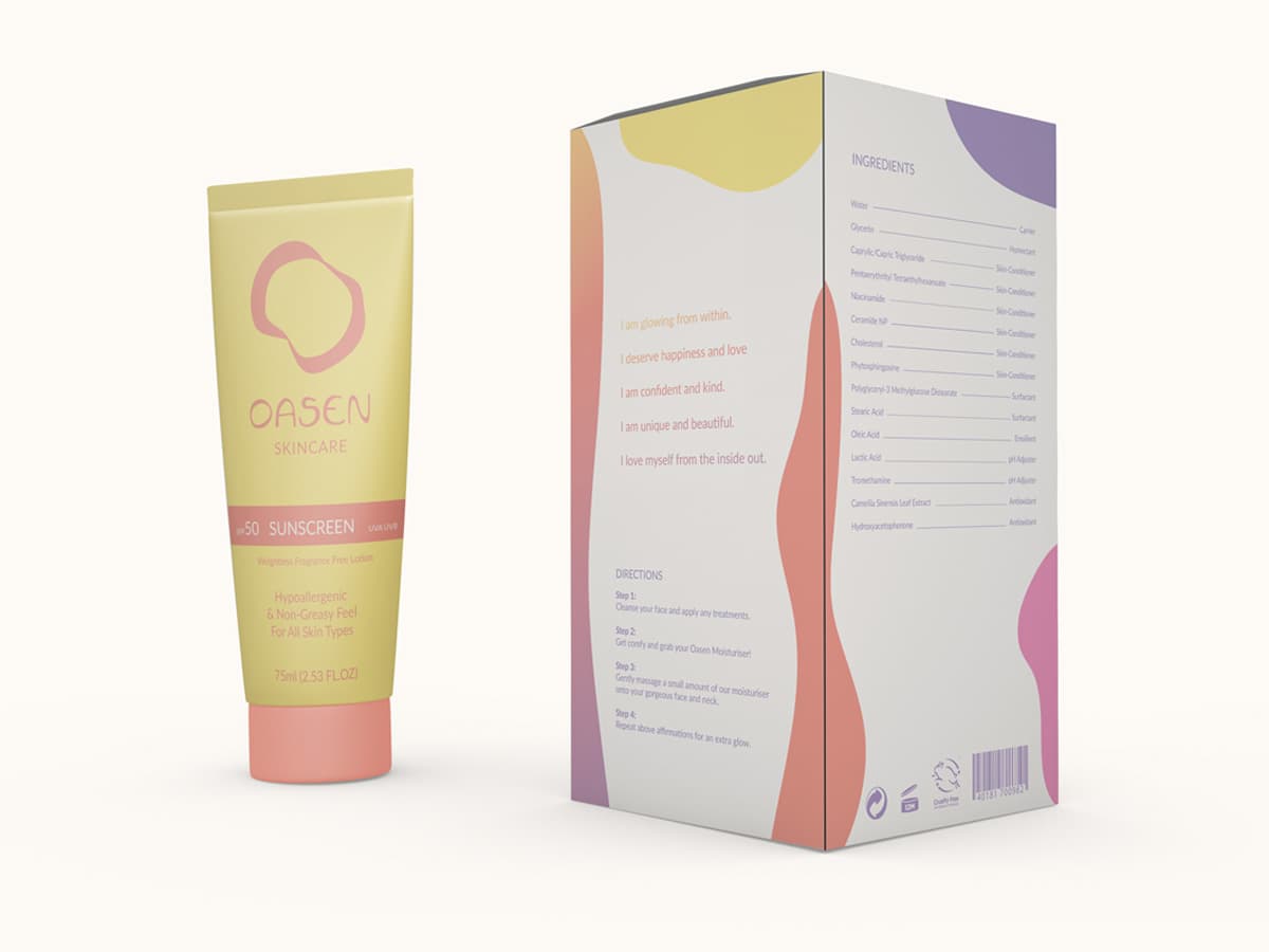
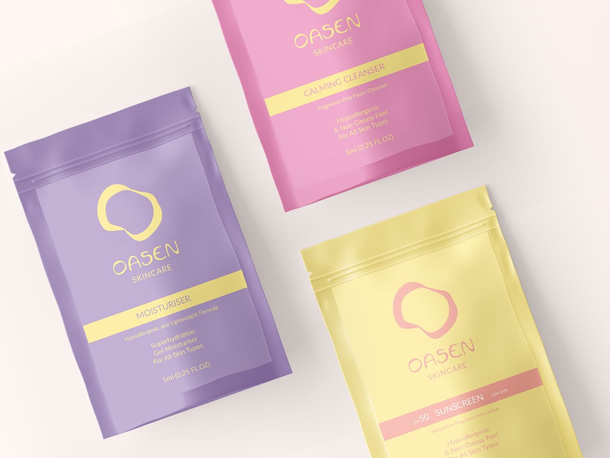
To empower people with sensory differences, we decided to create a sensory-safe skincare brand - Oasen. Launching a series of low-sensory pop-up stores in major cities, providing refuge from the hustle and bustle - giving neurodivergents a safe space and a chance to connect with others that share the same issues.
Visual Identity
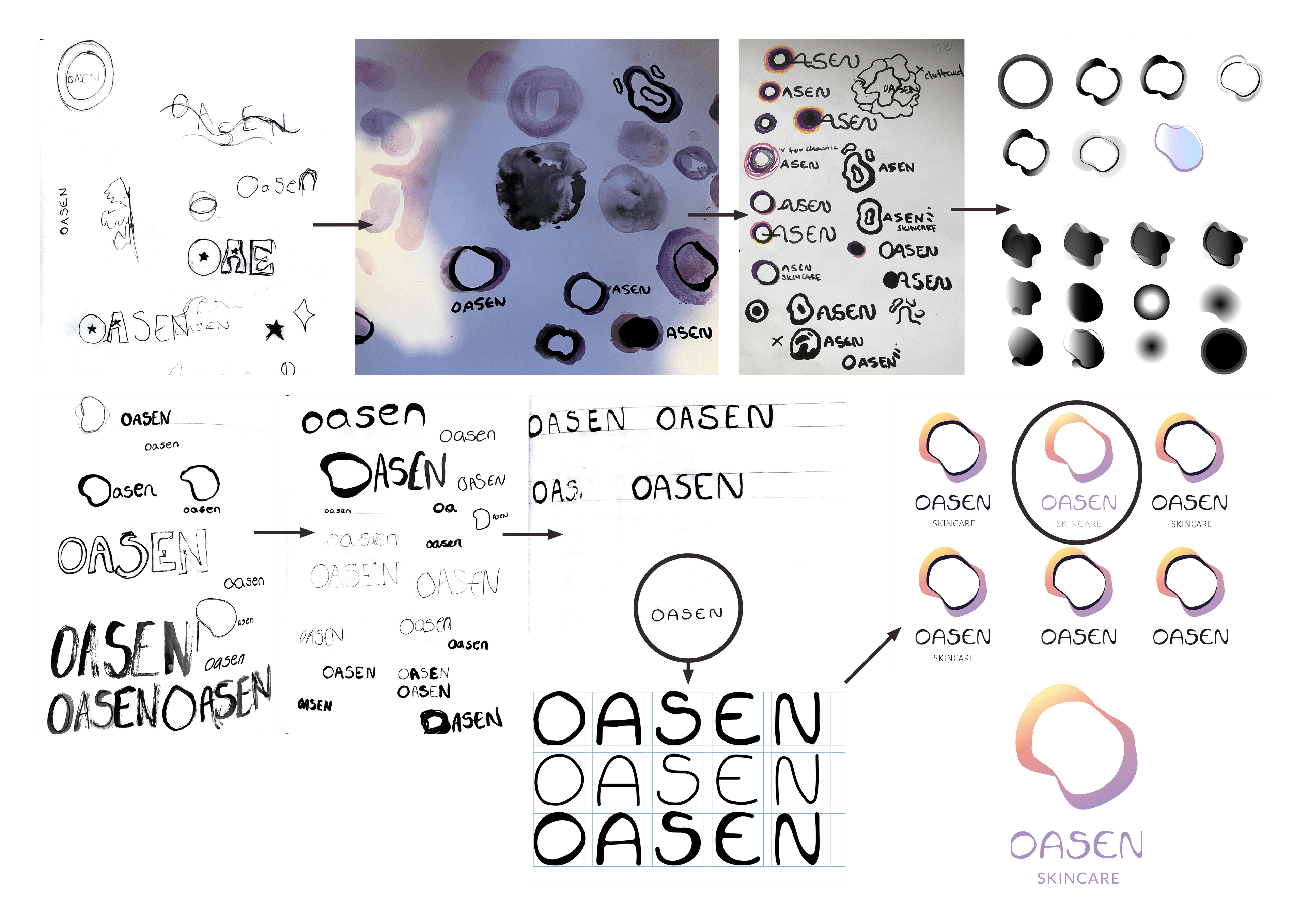
Logo and Type
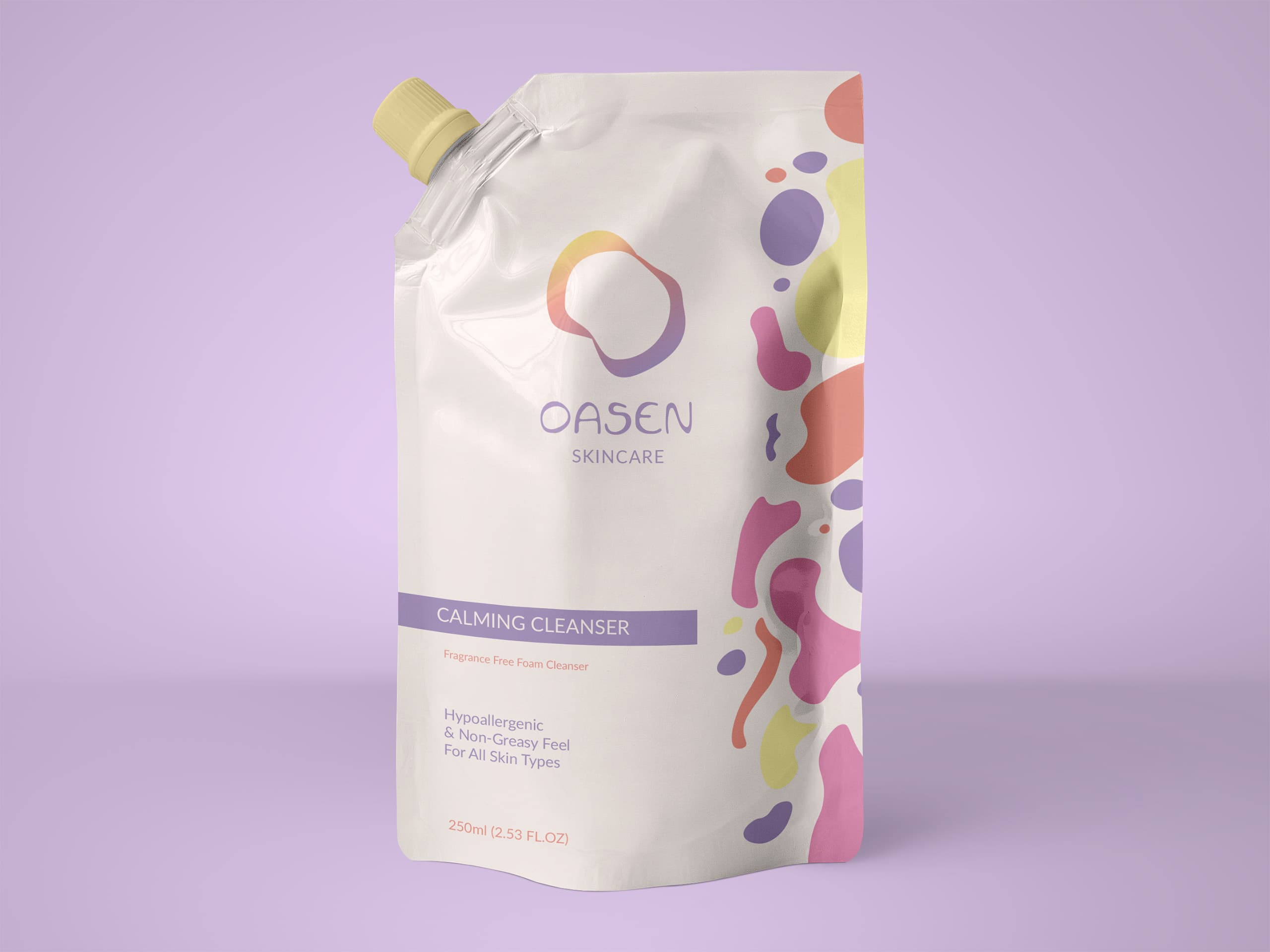
Oasen (Oasis) - a sanctuary. I brought the name into the logo through the soft oasis shape.
I hand-lettered 'Oasen' and chose a simple secondary typeface to compliment the lettering.
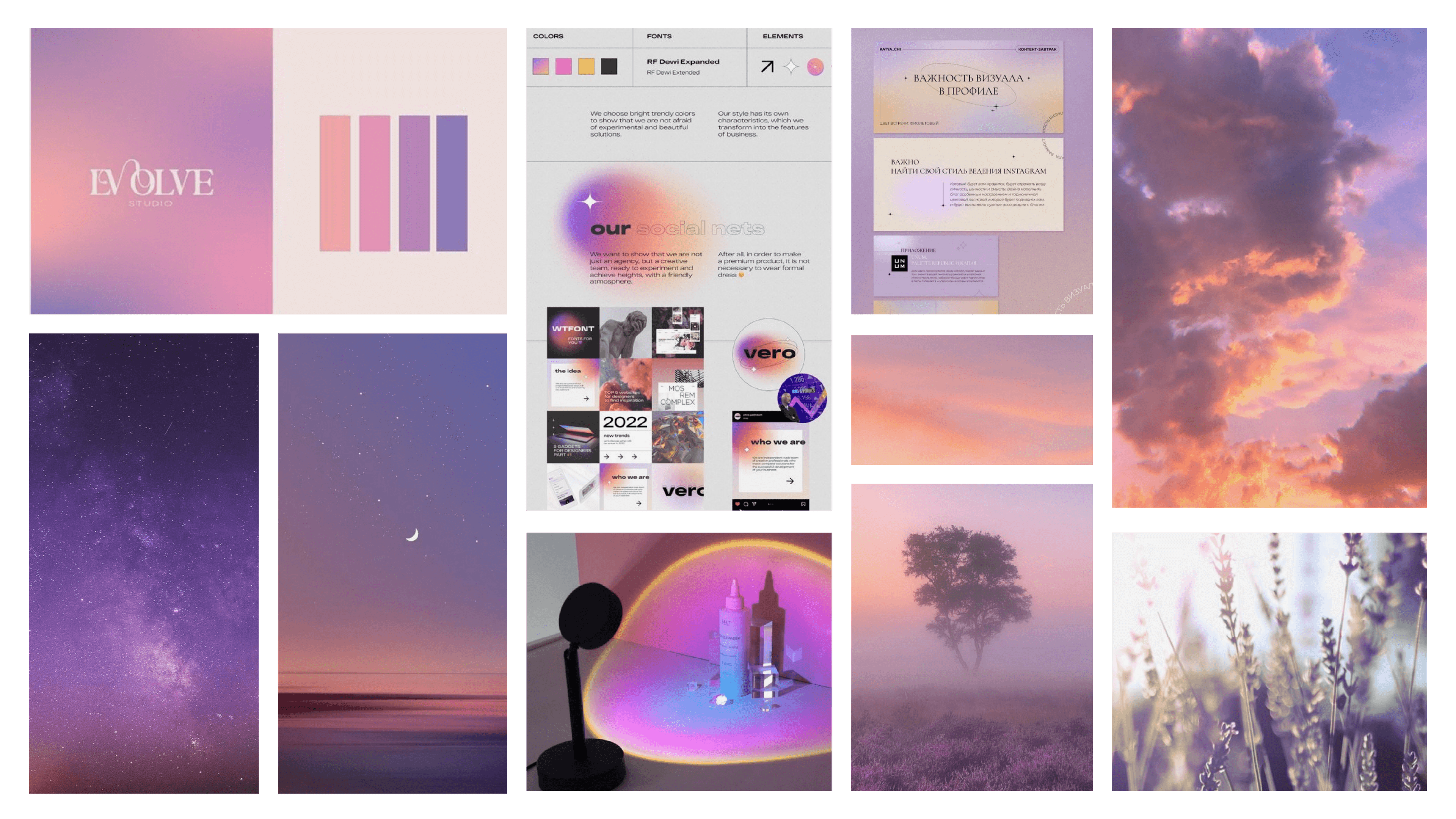
Colour
We opted for a soft sunset-inspired palette, avoiding bright and overstimulating colours.
Illustration
The blob illustrations were inspired by lava lamps - a visual stim tool for neurodiverse individuals.
Pop-up Store and Product Advertising